This Saturday Westchester Soccer Club begins a stretch of three home matches in their next four matches overall, and will look to keep building their home field momentum, which most recently saw a 3-0 win over their rival New York Cosmos.
Wynne Kenna takes a look at the popularity, and the mojo, around the club’s latest uniform kits, one of the most popular additions to the club on or off the pitch this season.
Unseen Challenges
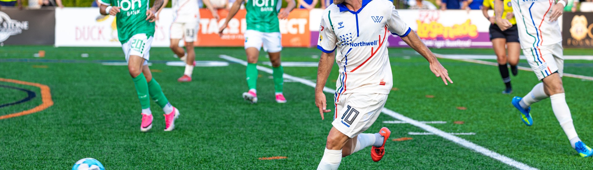
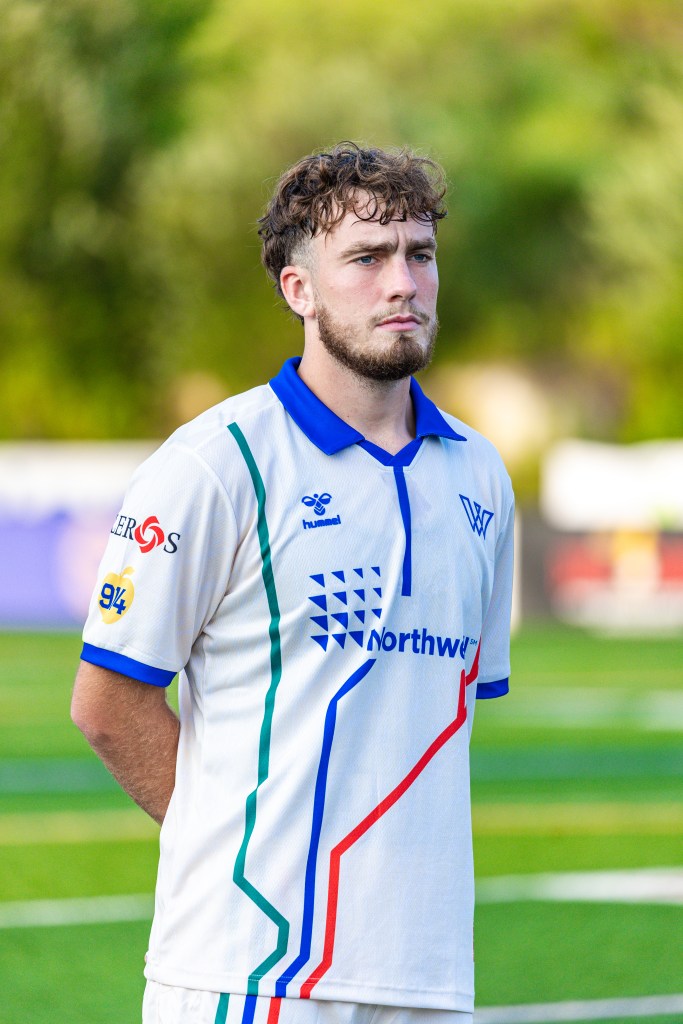
What really unifies Westchester County? This was the mindset behind Westchester SC’s newest kit. Town rivalries are deeply rooted, but there is little to no shared Westchester spirit; no single symbol that unites the whole county. The kit, which was released during the July 22 home game against the New York Cosmos, was designed to fix this issue. Westchester SC’s previous jerseys were made to resemble professional soccer kits, but none of them truly captured Westchester’s identity.
The design could not lean on any specific town, including Mount Vernon, where the club plays. Any creation that aligned with one municipality over the county’s other 47 risked failing to represent the county as a whole. It was Mason Asphar, Director of Partnerships and Brand for Westchester SC, who was tasked with finding the answer.
Building the Symbol for Westchester
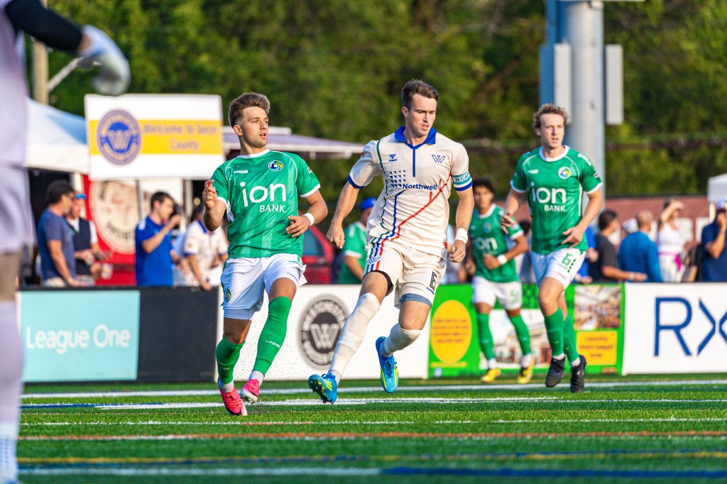
After countless time brainstorming, drafting, and revising, the answer was found within the county’s train lines. Three Metro-North lines: the Hudson, Harlem, and New Haven, all provide service convenient to Mount Vernon, and the kit design reflects this idea. Three stripes, one for each train line, run from the jersey to the shorts, representing the meeting point of the rail lines at Memorial Field. The symbolism resonates because the train lines link communities across Westchester and provide a connection throughout. No matter which town they call home, any resident can be a commuter. The concept extended beyond the design itself; bringing the idea to life meant working with Metro-North’s community relations team and turning inspiration into a real collaboration.
This was the purpose of the design from the beginning, to capture Westchester and provide the county with a unifying symbol. As Asphar described it, “the three lines speak to people.” His goal wasn’t to make a kit that appealed to people around the world, but one that belonged to Westchester.
Impact
Part of this idea was tied to accessibility. A family of four at Red Bulls or NYCFC games can spend up to $300 to $400 a night. Westchester SC tickets start at $10 and for most towns in the county, it is uncommon for a commute to Mount Vernon to take over 30 minutes. The kit was designed to embody that same idea: professional soccer that belongs to the county, not something that the county spectates from afar or feels disconnected from.
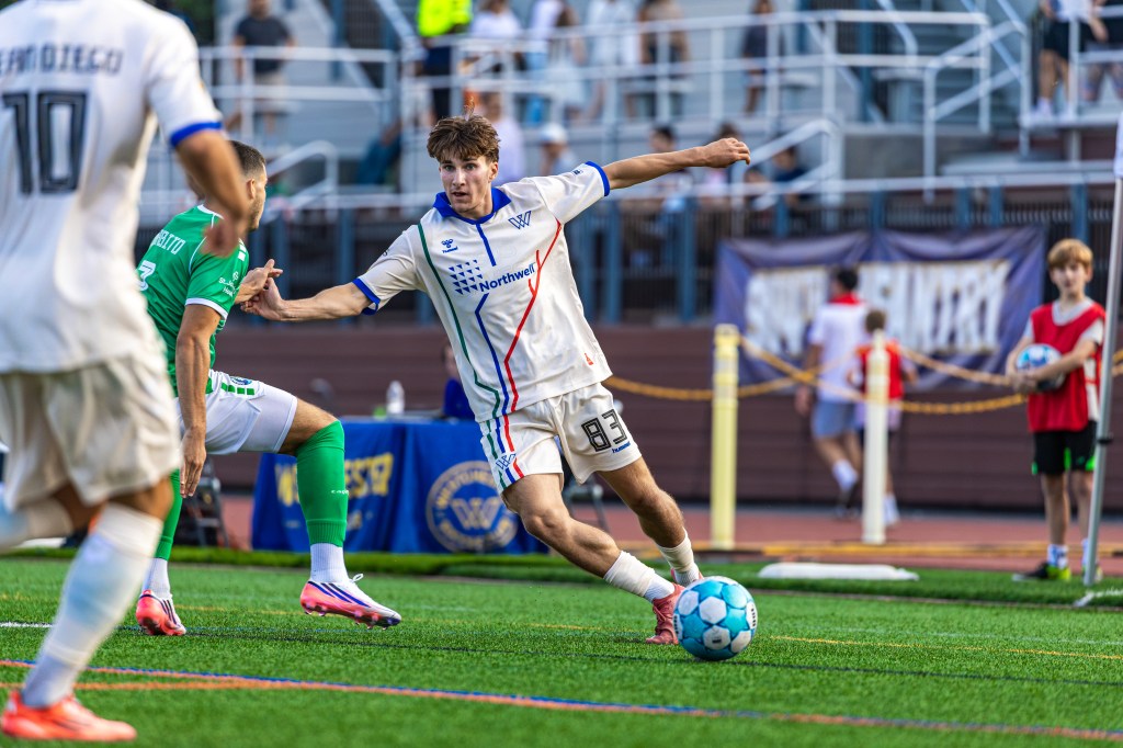
The community responded quickly. The jersey sold out within five days. The day the club unveiled the jersey, many of the club’s unpaid interns spent their own money to buy the jersey and wear it to support Westchester. For a club that is still in its infancy in the league and finding their identity, the level of support and the quick response from the community suggests the symbolism connected with the county the way it was intended. As Asphar explained, “it shouldn’t just be a sports jersey; it’s more than that. It’s a way to unify the county and further a shared identity.”